

Guignard Kyoto Collection
Calligraphy diptych | Mongolian calligrapher 蒙古王 (= ‘Mongolian King’) | 20th century
Calligraphy diptych | Mongolian calligrapher 蒙古王 (= ‘Mongolian King’) | 20th century
Couldn't load pickup availability
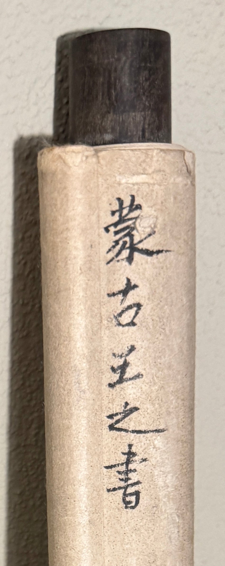
This calligraphy is fascinating because it is full of mysteries. For instance, on the back of the works, on the upper bar, there is an inscription that can be translated as ‘Mongolian King’ (or ‘Lord’, ‘Prince’, etc.). The term appears to be an old one – it dates back to Kublai Khan (1215–1294) and was still in use in the 19th century. Does this reference refer to the author of the text or the name of the calligrapher? Enquiries made to an expert in Mongolian culture, who collaborated on the exhibition on Mongolia at the Rietberg Museum (2025–26), failed to provide any clarification. The GUIGNARD KYOTO COLLECTION also contains another piece of Mongolian calligraphy in the style of the ‘One Hundred Variations on the Character for Happiness’, as was popular in China. From this, one can only conclude that Mongolian calligraphers and painters were, and remain, under the influence of Chinese art to a greater or lesser extent.
If we consider first the Chinese aspect of this diptych (is it actually a diptych, or are these two independently designed calligraphic works of the same composition?), the mounting is certainly strongly Chinese in character: in Japan, the two light-coloured strips on the outer longitudinal edges of the mounting are called minchō, meaning ‘Ming-period border’, which simply refers to ‘Chinese strips’.
The seals are barely legible, but in one of them three Chinese characters can be made out: 長、書、圖 (“long”, “writing”, “picture”); the fourth is obscured by a brushstroke to such an extent that it remains illegible. It is at least encouraging that these characters, interpreted as ‘long calligraphy’, would at least make sense in the context of these two objects (whether this interpretation is actually correct remains unclear).
If it is a Chinese or Japanese diptych, the signature lines are usually placed on the outer edges of the panels – here, both are found on the left-hand side.
Each of the two calligraphic works consists of four characters (in China and Japan, five characters are standard). The most striking feature of this calligraphy is the brush used: it is not tapered to a point, but is cut off horizontally at the front. This naturally produces completely different stroke effects. Interestingly, the characters in the signature are written with a ‘normal’ (Chinese) pointed brush. This suggests that the choice of a brush with a horizontally cut tip was an original artistic decision – not influenced by Chinese models. Some individual characters may appear somewhat harsh, whilst others are full of vigour and possess an enchanting graphic swing and elegance.